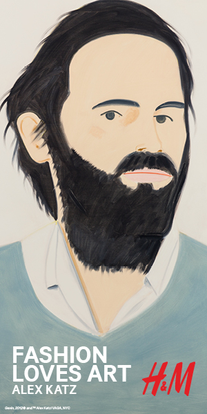
Alex Katz on His Five Decade Career, Collaborating with H&M, and Being a Millennial Icon
When artist Alex Katz confides to me that he's in good shape he's not kidding. The 89 year old painter is as sharp as ever, and still paints seven days a week. Although he insists he never goes out anymore, the work he is turning out from his studio is speaking louder than ever these days to a new millenial generation of style kids who relate to and are inspired by his signature icy cool and stylish aesthetic. The Swedish brand H&M was so inspired by Katz's work that they recently invited him to collaborate on a special collection out this month and I must say I want every single piece.
I caught up with Alex recently to hear from him what it feels like to be a hero to the fashion kids these days.
Kim Hastreiter: So, how is life as a legendary painter these days?
Alex Katz: Pretty good. I'm doing more and consistently good work than I've ever done before.
When did lightening strike you that you wanted to be a painter for your life's work?
I'd been studying art since I was thirteen and a half, formally. But I originally thought I'd be a commercial artist and lead a normal life or something.
And look at you now! So you're a New Yorker born and bred?
I was born in Brooklyn, then we moved out to Queens. I went to vocational school there because they had art half the day. The teacher was very good. Then I went to Cooper Union.
Tell me about your very first show.
My very first show was at a gallery in a frame shop called Roko Gallery on Greenwich Avenue. The paintings I did looked unfinished to most people, although I managed to sell four, all to artists.
When was your first big break as an artist.
I had a show in 1959 at the Tanager Gallery. It was a cooperative, but it was very highly focused so everyone in the art world would go to see it, and my show got a sensational response. It took me from obscurity to being well known below 14th street.
Did you ever make art in other mediums than painting?
I've done stage sets and costumes. I did about 30 years of work with the dancer Paul Taylor.
Why Paul Taylor? Did you know him?
Yeah. Robert Rauschenberg was doing Paul's sets and they had a quarrel over a costume Rauschenberg made. It had a still life that was supposed to be tied to Paul's back, and Paul said "No. I'm not dancing with a still life on my back." And everyone said, "Paul, I think Alex could make costumes so you should ask him." So Paul asked and I said, "Okay." and it was successful. So we started working together.
Have you ever done editions of your work that are more mass and accessible to those who can't afford your paintings? Did you ever make sneakers or anything like that?
Well, Barney's a few years back made a line of high end home stuff with me, and now I am doing a big line of affordable clothes with H&M. It's fabulous and looks really good.
Do you feel the fine art world looks down on artists who do commerce?
I would think so, but I couldn't care less.
I always felt like Keith Haring or Andy Warhol, because of their fascination with pop culture and commerce, weren't accepted or respected as fine artists.
I think my art is for all people. It's not particularly pretentious. I like to think of Giotto, where everyone could get it on that kind of level.
After all Malevich did costumes for Ballet Russe and Salvador Dali did a perfume bottle for Elsa Schiaparelli, and Andy Warhol did fashion with Stephen Sprouse. Tell me how this H&M collaboration came about?
It was brokered through my Paris art dealer Thaddaeus Ropac. When the H&M people brought the stuff around, I loved it! It was just fabulous and it looked really good.
Well, you know, they're from Sweden, and the Swedish have good taste. When I think about it, it seems like Sweden would be a country that is very compatible with your work's aesthetic.
Yes! They seem to be on the same wavelength. Also they did a lot of research, and a lot of thinking went into the designs and the products. I give them a lot of credit.
Your work just resonates with something that's in the zeitgeist right now. Especially in the fashion world. Your work is beautiful, and it's also kind of icy. It has a certain aloofness and modernity that you can sometimes find on fashion catwalks these days.
A lot of the art world is controlled by art historians. And many of them think art is frozen, but actually, art is very connected with fashion. I think it goes in three year cycles, just as fashion does. Fashion is a great big thing that goes through the whole European American world, and art tries to hook onto it just like everything else. Many think that people control the art world and what's in fashion, but they don't. It's something that runs amok. We artists don't make this stuff up by ourselves, it's just our response to the culture.
You're not fickle in your work, changing your art with what's in style or not in style. Your work has always been consistent. As an artist, how do you keep from feeling like you're repeating yourself?
You just try new things all the time. Different ideas come to you and you use different tools. Lately, I've been using the iPhone to get many images and multiple splits.
Do you always paint people?
It's people in these big environmental landscapes.
So right this minute, are you painting people? Portraits?
More or less. Most of them are going to be people walking away from you.
Do you look at a lot of young artists' work?
Yeah, because at the foundation we buy stuff and give it to museums that will sell it. So, I'm forced to see a lot of young artists.
And do you ever still teach?
No. I stopped. I used to teach at Yale and later on when I was teaching at Pratt, a girl came up and said, "Alex, what are you doing wasting your time here with us?" But it was fun teaching. That is how I learned to talk. Painting is internal talking in a way. Teaching art forces you to articulate ideas, and so I got as much out of it as the students did.
What kind of advice would you give a young aspiring painter just out of art school?
Well you've got to work hard. Painting is a craft and it takes a long time to master the craft. I work seven days a week.
Does it shock you to find out that you've become this major cult hero for the coolest young kids these days? I mean, you probably know, because your kids probably clue you in.
It's kind of funny. People stop me in the street now. Basically I'm still in the studio, and I'm still that same person who had non negotiable work for 20 years.
That's what happens. You just keep doing what you do, and people come around.
I was always trying to make something new. But now I feel the world caught up with me.
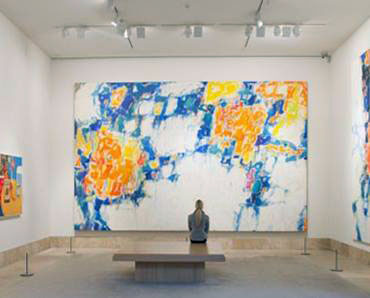
Review: A fine introduction to Sam Francis' Abstract Expressionism
Probably the most significant Sam Francis painting in an American collection is "Basel Mural I," which hangs in Pasadena's Norton Simon Museum.
Part of an epic 1956 commission from a Swiss museum director, the canvas assembles patchy clouds of veiled, liquid color - watery blue, bright yellow and deep orange - that seem to grow and multiply like organic cells within a luminous white field. When it was finally installed two years later in the grand stairwell of the Basel Kunsthalle with its pair of companion paintings, the trio cemented Francis' reputation as a major artist.
Despite its current location, "Basel Mural I" is not included in the lovely exhibition "Sam Francis: Five Decades of Abstract Expressionism from California Collections." That's no surprise. Even if there was adequate gallery space in the Pasadena Museum of California Art, where the show opened Sunday, just getting the mural moved across town would be a difficult task.
More than 12 feet tall and nearly 20 feet wide, it approaches the enveloping scale of a big, 1920s Claude Monet waterlily painting, which was part of the inspiration for Francis' work. One revelation of the show, however, is that in Francis' best paintings, size doesn't really matter.
The first fully realized work one comes across in the exhibition, which is installed in a loose chronology, is painted on a piece of paper only about 8 by 10 inches. Made around 1953 and titled "The Line," it's like the Basel mural in gestation.
Little commas of runny gold, red and blue watercolor dart across the sheet. A thick, jagged, irregular line of black ink separates upper and lower registers. (I'd guess that motif comes from a close study of the slightly earlier paintings of Clyfford Still.) Rather than size, it is scale that carries "The Line."
Scale is about the space between things, rather than the things themselves. Francis' carefully crafted relationships between the individual painterly marks and the overall composition, the composition and the framing sheet of paper, and the sheet and the viewer establishes a concentrated energy that effortlessly pulls you in.
In the process, the unpainted portions of the paper become as lively and powerful as the painted parts.
One result: Microcosm is indistinguishable from macrocosm. As with the huge "Basel Mural I," the tiny watercolor is akin to a view through a microscope toward a spirited cluster of living cells or through a telescope to exploding galaxies in deep space. The sheer face of a vast mountain cliff is equated with a sidewalk puddle clotted with autumn leaves. The visible world is wholly abstract.
And since we're talking about "The Line," what is a line anyway? And when does a line become a shape?
Sure, a line is a surface mark longer than it is wide, or a point moving through space; but one of those is physical and tangible, while the other is an immaterial idea. Francis' art coaxes an array of generative musings.
Critic Tyler Green once noted that the composition of "Basel Mural I" bears an abstract resemblance to Michelangelo's famous ceiling fresco, "The Creation of Adam." A range of languorous and dramatic colors is clustered in clouds at the lower left and upper right, and these vivid zones of energy are connected by a thin, electric blue line of barely touching shapes. Francis may or may not have intended the historical reference, but the mural thrums with a secular spark of life.
Throughout his career - Francis died in Santa Monica in 1994 at 71 - the artist engaged philosophical conundrums in paint. He was an avid student of Jungian psychology and Japanese aesthetics. (His paintings bear deep connections to Japanese sumi-e calligraphy.) Watercolor was his most-common choice of painting medium, whether in the conventional form used on paper or its popular 1960s canvas-cousin, acrylic paint.
The Basel murals, along with luminous examples of other 1950s paintings in the show, are made with thinned oil paint. But fluidity is key to all his most successful series.
That goes for the early 1960s orbs of expanding color in the "Blue Balls" works; the mid-'60s edge paintings, which apply lush color to just the framing edges of the canvas while leaving the central area a bright, somehow muscular and visually aggressive white; or, the incredibly complex 1970s grids, in which crisp linear structure somehow melds with oozing liquidity.
Watercolor is what Francis started with when he first picked up a brush - on March 7, 1945, at the age of 21. We know the exact date because he began to paint as a form of physical and psychological therapy, following a wartime airplane crash.
In addition to back injuries, he developed spinal tuberculosis, maladies that plagued him throughout his life. Francis spent most of the next three-plus years in a body cast, sometimes suspended in a sling.
Learning to paint with watercolor was a practical way to pass the time. A few landscape examples from 1945-46 at the start of the show demonstrate his rapidly gained facility.
He probably didn't know it, but in using watercolor on paper Francis was tapping into what is probably the most-sustained tradition of excellence in modern American art of the 20th century's first half. After the war, the tradition moved from paper to canvas. Fluid color became a primary visual dialect of adventurous American painting, preeminent in the work of Gorky, Pollock, De Kooning, Frankenthaler, Rothko and more - including Francis.
He was peripatetic, living and working in the Bay Area, Paris, Tokyo, Mexico City, Los Angeles and elsewhere - although hardly ever in New York. The Pasadena show is drawn exclusively from collections in California, where he produced most of his art.
Aside from the ease of borrowing work for the exhibition, the California emphasis serves to underscore how Abstract Expressionism is much more than the New York School.
In the late 1940s and early 1950s it emerged and evolved simultaneously in pockets of creative efflorescence around the country. The G.I. Bill was a major reason why: For the first time, American artists were being trained within the intellectual milieu of colleges and universities. (Thanks to the program, Francis went to UC Berkeley.) An important concentration of artists gathered in San Francisco, especially around the California School of Fine Arts.
The show was organized by guest curators Peter Selz and Debra Burchett-Lere (director of the Sam Francis Foundation) for the PMCA and Sacramento's Crocker Art Museum, where it travels in January. It is not a full retrospective, although the selection spans Francis' working life. But with 40 paintings on canvas or board and another 56 on paper - plus "Basel Mural I" hanging in a museum nearby - it is a satisfying and wide-ranging introduction to a marvelous artist's work.
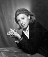
Helen Frankenthaler, noted abstract painter, dies at 83
Helen Frankenthaler, an influential abstract painter whose quietly eloquent canvases of the 1950s inspired the Washington Color School of painting, died Dec. 27 at her home in Darien, Conn. She was 83.
Her family released a statement about her death but did not provide an exact cause.
Ms. Frankenthaler was best known for developing an innovative technique in which she poured diluted paint directly on the canvas, creating washes of color that flowed with the illusion of movement and depth.
Called "stain painting" or "soak stain," her method helped push the bold, aggressive abstract expressionist art of the 1940s toward a new level of subtlety and beauty.
Ms. Frankenthaler was only 23 when she painted "Mountains and Sea," a landmark work in the history of modern art. In the early 1950s, she had visited the studio of Jackson Pollock, the leading abstract expressionist, and had come away mesmerized by the way he dripped paint onto canvases lying on the floor.
"It was original, and it was beautiful," she told the New York Times magazine in 1989, "and it was new, and it was saying the most that could be said in painting up to that point - and it really drew me in."
Emulating Pollock's style, Ms. Frankenthaler set a large canvas, 7 by 10 feet, on the floor of her New York studio one day in 1952. She deliberately left it untreated, without a preliminary coat of priming.
Thinning her oil paint to a watery consistency with turpentine, she poured shades of blue, pink, green and gold onto the canvas from coffee cans. The paint soaked into the woven fabric like a wine stain spreading into a tablecloth.
She had not sketched any patterns or images, but as Ms. Frankenthaler stood back from the painting, it reminded her of the rocky coast of Nova Scotia, which she had recently visited. She called the painting "Mountains and Sea."
"Because her method is intuitive, her pictures flirt with failure," Washington Post art critic Paul Richard wrote in 1975. "She pours, she looks, she pours again. . . . The color seems to move, to billow. Her outlines grow from inside out."
In 1953, two D.C. painters, Morris Louis and Kenneth Noland, were invited to Ms. Frankenthaler's studio by her lover at the time, the powerful critic Clement Greenberg. The artists were so struck by the painting, in which the color and surface blended into one, that they returned to Washington with a new vision.
They made the manipulation of color the focus of their art and soon launched what became known as the Washington Color School or, more broadly, "color-field" painting.
"She showed us the way to think about and use color," Noland later said.
Although she was considered a charter member of the color-field school, Ms. Frankenthaler resisted artistic labels. And although she was one of the foremost female artists of her time, yet she said she had no interest in being a part of the feminist movement.
In the 1960s, she switched from oil to acrylics and began to use sponges, brushes and squeegees to spread paint across the surface. She made important advances in printmaking, tapestries and woodcuts. In almost all of her work, she followed a private aesthetic vision that valued a soft beauty that was often at odds with the bravura, more aggressive styles followed by many male artists.
"Painting is very private and personal," she told The Post in 1972. "There's an emotional content, but I'm more involved in the light and color and drawing of a painting. I don't set out to portray an emotion."
"What concerns me when I work," she told the Times in 1989, "is not whether the picture is a landscape, or whether it's pastoral, or whether somebody will see a sunset in it. What concerns me is - did I make a beautiful picture?"
Helen Frankenthaler was born Dec. 12, 1928, in New York City and was the daughter of a judge. She attended private schools and graduated in 1949 from Bennington College in Vermont.
She came back to New York to paint and immediately drew the attention of Greenberg, who introduced her to major artists, including Pollock, Lee Krasner, Willem de Kooning and Franz Kline.
In 1958, Ms. Frankenthaler married Robert Motherwell, another key figure in abstract expressionism. They were divorced in 1971.
Survivors include her husband of 17 years, Stephen M. DuBrul Jr.; and two stepdaughters.
Ms. Frankenthaler had retrospectives at many major museums throughout her career, including the Museum of Modern Art in New York and Washington's Corcoran Gallery of Art and National Gallery of Art. In 1975, she made a long-term loan of "Mountains and Sea" to the National Gallery, which has 28 of her works in its collection.
Ms. Frankenthaler had a patrician, often aloof manner and seldom liked to cast light on the creative energies behind her work.
Many of her paintings suggested imaginary landscapes, with a latent undercurrent of emotion, but Ms. Frankenthaler insisted that her central interest was simply putting paint on canvas in an interesting way.
An unprecedented region-wide collaboration that includes more than 60 cultural partners, 60+ exhibitions, dozens of galleries and an eleven-day performance art festival in celebration of the rise of the Los Angeles art scene.
An experimental city by all accounts, Los Angeles has been variously described as an "earthly paradise," a "huge desert encampment," a "city of dreadful joy," or, more recently, a "city of quartz." A place at once raw and compelling, it spawned an art that is equally multifaceted, bringing new materials, visions, and technical skills to the project of radical artistic innovation.
Pacific Standard Time: Art in L.A. 1945-1980, a collaboration between the Getty Foundation and the Getty Research Institute, documents the emergence of Los Angeles as an international nexus of contemporary art after World War II. It culminates in a series of over forty concurrent exhibitions across Southern California in fall 2011.
Takashi Murakami helps Google celebrate summer (and winter) solstice.
Takashi Murakami is famous for his brightly colored, Superflat creations that draw from manga, anime and other aspects of Japanese pop culture. On Tuesday, Murakami contributed designs featured on the Google homepage to celebrate both the summer solstice in the Northern Hemisphere and the winter solstice in the Southern Hemisphere.
The summer solstice is the longest day of the year and signifies the first day of summer. It occurs when the Earth's axis achieves its greatest tilt toward the sun. Conversely, the winter solstice occurs in the opposite hemisphere on exactly the same day.
Tuesday's Google doodles feature Murakami's signature alien-like creatures rendered in his trademark style. In 2007, L.A.'s Museum of Contemporary Art held a retrospective of Murakami's artwork. The exhibition, titled "Copyright Murakami," drew record crowds to the museum's space at the Geffen Contemporary.
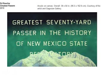
Ed Ruscha: On the Road June 4, 2011 - October 2, 2011
This exhibition, organized by Hammer chief curator Douglas Fogle, brings together two great visionaries of art and language - Ed Ruscha and Jack Kerouac. Both men revolutionized the transparent use of words to document and comment on the shifting character of the American cultural landscape.
In 1951, Kerouac wrote On the Road on his typewriter as a continuous 120 foot-long scroll, feverishly recording in twenty days his experiences during road trips in the U.S. and Mexico in the late 1940s. With its publication in 1957, Kerouac was acknowledged as the leading voice of the Beat Generation, a group of writers that included Alan Ginsberg and William Burroughs.
Over the last few years Ed Ruscha has continued to explore his own fascination with the shifting emblems of American life by turning his keen aesthetic sensibility to Kerouac's classic novel. Having created his own limited edition artist book version of On the Road in 2009 published by Gagosian Gallery and Steidl, and illustrated with photographs that he took, commissioned, or found, Ruscha has created an entirely new body of paintings and drawings that take their inspiration from passages in Kerouac's novel.
As Douglas Fogle suggests, "It is completely fitting that Ed Ruscha would take up the challenge of looking at Kerouac's On the Road. In many ways Ruscha's entire career has offered an artistic corollary to Kerouac's linguistic portrait of the American landscape, giving concrete visual form to the poetry of our vernacular roadside. These new works are no different except that they channel one of the greatest chroniclers of the American landscape by appropriating and artistically framing fragmented instances of Kerouac's language."
This exhibition includes Ruscha's edition of Kerouac's legendary novel, six large paintings on canvas, and ten drawings on museum board, each taking its text from On the Road. Whether painted over snow-capped mountains in Ruscha's signature all-caps lettering or drawn atop delicately spattered abstract backgrounds, Kerouac's words provide the artist with a means to explore his own archetypal landscape. Isolating key sentences and phrases from the novel for his paintings and drawings such as "In California you chew the juice out of grapes and spit away the skin, a real luxury," "the holy con man began to eat," or "fit and slick as a fiddle," Ruscha adds another layer of deadpan aesthetic analysis to Kerouac's original and radical use of language.
This exhibition is made possible by a major gift from The Brotman Foundation of California. Generous support is provided by Lannan Foundation, Michael Rubel and Kristin Rey, The Fran and Ray Stark Foundation, and Linda and Jerry Janger.
KCRW 89.9 FM is the official media sponsor of the exhibition.
Metropolitan Museum of Art Opens Richard Serra Drawing: A Retrospective April 13, 2011-August 28, 2011
This first retrospective of drawings by the contemporary American artist Richard Serra (b. 1939) presents a comprehensive overview of some forty years of his drawing activity. It traces the development of drawing as an art form independent from yet linked to his sculptural practice. Drawing for Serra has always played a crucial role in the investigation of new concepts and new creative methods. It has been a means of exploration of formal and perceptual relationships between the artwork and the viewer. His innovative ideas have radically transformed the traditional understanding of drawing as a form outlined against a background of the paper support, and exponentially expanded the definition of modern drawing through novel techniques, unusual media, monumental scale, and carefully conceived relationships to surrounding spaces.
Through some fifty drawings and a selection of sketchbooks, the exhibition presents the evolution of Serra's drawing from the early 1970s-when he worked primarily on paper with more traditional mediums such as ink, charcoal, lithographic crayon-to the mid-1970s when he turned to black paintstick, a crayon comprised of a mixture of pigment, oil, and wax. He has been using paintstick in its various forms since then, creating heavily textured works in which thick black surfaces, frequently very large in scale, emphasize his interest in process, weight, and gravity. Black, in Serra's understanding, is not a color but rather a material; it therefore has weight and responds to the laws of gravity.
In the mid-1970s, Serra made his first Installation Drawings-monumental works on canvas or linen pinned directly to the wall and thickly covered with black paintstick, such as Abstract Slavery, Taraval Beach, Pacific Judson Murphy, and Blank.
The drawings Serra has executed since the 1980s continue the experiments with innovative techniques and explore further surface effects, primarily on paper, and while very large and monumental in expression, they are less monumental physically. The process of creation remains an essential aspect of their expressive power. Generally made in series, such as Rounds (1997), out-of-rounds (1999), and Solids (2007-2008), they highlight dense paintstick, frequently pressed through a window-like screen, which allows a heavily textured surface of viscous pigment to develop.
The exhibition culminates in site-specific, large-scale works, completed specifically for this presentation. The selection of sketchbooks from different decades and places completes the understanding of the artist's use of drawing as a system of thinking.
The exhibition is made possible in part by the Jane and Robert Carroll Fund.
It was organized by the Menil Collection, Houston.
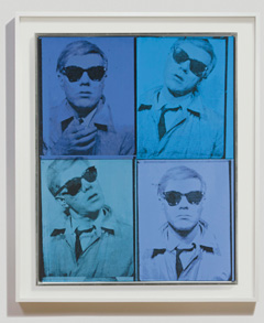
Andy Warhol Painting Bought for $1,600 Could Fetch $30 Million at Christie's Sale
NEW YORK, N.Y (REUTERS).- An Andy Warhol self-portrait purchased in 1963 for $1,600 on an installment plan is poised to fetch $30 million or more when it hits the auction block at Christie's in May.
"Self-Portrait," a four-panel acrylic silkscreen depicting the pop artist wearing a trench coat and sunglasses, is being sold by the family of Detroit collector Florence Barron.
Barron first commissioned Warhol to paint her portrait, but changed her mind and suggested the young artist depict himself, telling him, "Nobody knows me ... They want to see you."
The result was Warhol's first self portrait, four images taken in a coin-operated photo booth rendered in hues of blue.
"My mother didn't look at collecting in terms of 'is this important or not important,'" Guy Barron told Reuters.
"She looked at it from the standpoint of what resonated with her, and of 'I want to live with it.' It was not done as some people do today, as wall power."
The portrait graced the living room wall of the family home in Detroit. It also went on public display, serving as the cover image for catalogs from major Warhol exhibitions and retrospectives at the Museum of Modern Art in New York and the Guggenheim in Bilbao, Spain.
Brett Gorvy, Christie's international co-head and deputy chairman for post-war and contemporary art, said the work marked the beginning of Warhol's own stardom.
"With dark sunglasses an oblivious gaze, Warhol was ahead of his time in creating a new archetype of glamour," Gorvy said.
"The painting is remarkable not only for its visual impact and the introduction of the photo booth genre, but for marking a key moment in the history of art, when Warhol takes his place in the pantheon of celebrity alongside Marilyn, Elizabeth and Elvis."
Barron, whose family includes two married sons and several grandchildren, said they were auctioning the work because "dividing is not possible, so selling makes the most sense."
"I feel that Andy Warhol himself would appreciate this, because he always talked about everyone in their lifetime having their turn in the spotlight for 15 minutes. Who'd have thought that his self-portrait would play such a role in our lives?"
The record for a Warhol self-portrait is $32.6 million set last May at Sotheby's in New York. The record price for any Warhol sold at auction is "Green Car Crash (Green Burning Car I)," which Christie's sold for a whopping $71.7 million in 2007.
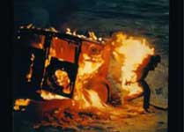
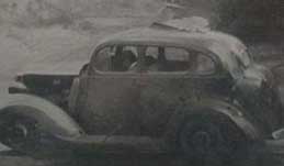
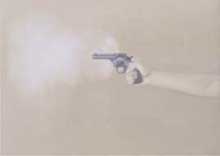
LACMA TO HOST EXHIBITION OF VIJA CELMINS WORK CREATED IN LOS ANGELES BETWEEN 1964 AND 1966
(Los Angeles, February 1, 2011) The Los Angeles County Museum of Art (LACMA) presents Vija Celmins: Television and Disaster 1964-1966, exploring an essential yet often overlooked period of the artist's work. Throughout much of her career, Vija Celmins has been internationally recognized for her meticulously executed paintings and drawings using a monochrome palette of black and gray, depicting starry night skies, ocean waves, barren desert floors, and fragile spider webs. But the images that first grounded her interest as a young artist in Los Angeles during the early 1960s are characterized by violent themes such as crashing warplanes, smoking handguns, and other images of death and disaster influenced by the violence of the era-the war in Vietnam, social change, political assassinations-and the mass media that represented it: newspapers, magazines, and television.
Organized by the Los Angeles County Museum of Art and The Menil Collection, Houston, Vija Celmins: Television and Disaster 1964-1966 is the first exhibition to concentrate on an important segment of Celmins's art dictated by a specific time and subject matter. Recent survey exhibitions at the Centre Pompidou, Paris, and the Metropolitan Museum of Art, New York, have concentrated on her drawings and prints, respectively. Bringing together paintings and sculptures from national and international museums and private collections, all from a brief three-year period, this exhibition uncovers the technical and thematic groundwork from which Celmins would build her international career.
The exhibition curators are Franklin Sirmans, the Terri and Michael Smooke Department Head and Curator of Contemporary Art at LACMA, and Menil Collection Associate Curator Michelle White. "It was between 1964 and 1966, before she was 30 years old, that Celmins created some of her most important pieces in her Venice Beach studio," said Sirmans. "She was aware of what was happening politically and socially in the world via television, newspapers, and magazines, and thus her work evolved-entwined with time and memory of family and growing up."
When Celmins arrived in Los Angeles in 1962, the city's art scene was realizing its final break with Abstract Expressionism, forging a coolly detached Pop Art aesthetic unique to Southern California. With Walter Hopps's Ferus Gallery at its epicenter, artists such as Larry Bell, Joe Goode, and Ed Ruscha offered stylistic alternatives to both Abstract Expressionism's action painting and New York's bold version of Pop Art. The city's artists sought inspiration in found art and the painting of common everyday objects, creating a fluid new language to critique the decade's increasingly commercialized and media-driven culture. Though often associated with the Pop artists of the 1960s, Celmins's work is equally indebted to Conceptualism.
Never fully linked to the California Pop movement, Celmins is often overlooked as an important figure in post-Abstract Expressionist art. Television and Disaster brings to light the artist's ability to appropriate the media of her era-from newspapers and magazines to snapshots and television-to speak to her own background, while offering a distinctive contribution to this cool and aloof aesthetic. Vija Celmins was born in 1938 in Riga, Latvia, and fled with her family to Germany in advance of the Soviet army's invasion in 1944. Migrating to the United States in 1948 after World War II, the family settled in Indianapolis, where Celmins took art classes and graduated from the John Herron Art Institute with a BFA. In 1961 she received a scholarship to attend the Yale Summer School of Art and Music, where she met artists Brice Marden and Chuck Close. A year later, Celmins relocated to the West Coast to attend graduate school in painting at the University of California, Los Angeles. She has lived and worked primarily in New York since 1981.
Credit: This exhibition is co-organized by the Los Angeles County Museum of Art and The Menil Collection, Houston. It comes to LACMA from The Menil Collection where it opened on November 18, 2010, and continues through February 20, 2011
Images: #1) Vija Celmins, Burning Man, 1966, McKee Gallery, NY, c. Vija Celmins 2011 #2) Vija Celmins, Tulip Car #1, 1966, McKee Gallery, NY, c. Vija Celmins 2011 #3) Vija Celmins, Gun with Hand #1, 1964, Menil Collection, c. Vija Celmins 2011